
Currently at Unite Us. Previously at Tonchin NYC.

Angel Anzures (illustration),
Ashley Randall (photography),
Tappei Sawasaki (photography),
Kana Motojima (photography),
Kaede Yamada (translation),
Yuto Watanabe (translation),
Mika Nishimura (translation),
Anne Pesquié (translation)
Presented in English, Japanese, Spanish, & French, A Place To Gather was created as a holiday gift for Tonchin's workers. The publication features 4 in-depth interviews with Tonchin employees, all of whom have contributed meaningful things to Tonchin's food, culture, and atmosphere. Presented in English, Japanese, Spanish, & French, A Place To Gather was created as a holiday gift for Tonchin's workers. The publication features 4 in-depth interviews with Tonchin employees, all of whom have contributed meaningful things to Tonchin's food, culture, and atmosphere.


Kaede Yamada (project management), Sandy Ha (brand management)
As a designer who had once worked at Tonchin as a server, I was perfectly primed to know the failure points of existing menus and merch—I was my own AB testing. We began by revisiting the menus, streamlining their content and adding helpful icons and illustrations to convey drink portion size to guests. Space was left for customer—server interaction by answering the most crucial menu questions (ingredients, allergies) while leaving some mystery (what exactly IS maguro, what is the sake of the day?) for Front of House workers to spin their hospitable charm.
The merch options seen here were entirely conceptualized by me, mostly in response to customer inquiry and my own instincts in translating Tonchin's unique visual and physical identity into design work. In the hoodie design, you'll see the physical placesetting of the restaurant (the chopsticks, bowls, and napkins) converted into a ramen mandala, a meditation on Tonchin itself.


Avantika Velho (biodesign co-lead),
Manini Banerjee (biodesign co-lead),
Katia Zolotovsky (advisor)
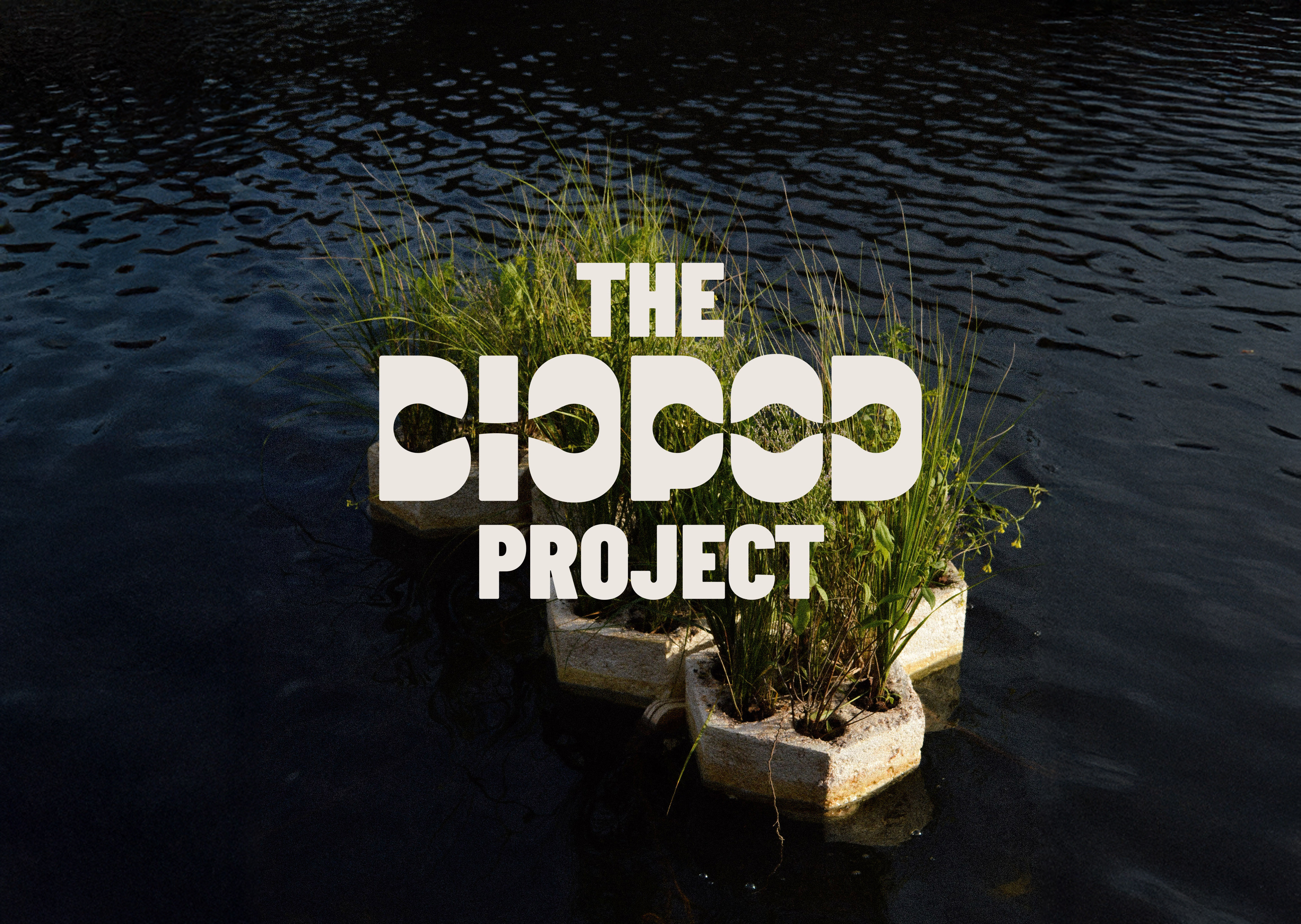
In short, Biopods are human—scale, modular, floating wetlands, developed by my team as part of our work supported by the RISD Somerson Sustainability Innovation Fund. Built from mycelium mushroom and local wetland plant life, the Biopods purify water through bioremediation: the use of naturally occurring ecologies to depollute a given site. In other words, they allow the plants to take in polluted water through their roots, filter it through their natural life cycles, and deposit healthy water back into the river over time.
The goal was to creative a flexible, organic, scalable identity system for the project as we moved into the planning of public—facing events with the city of Providence.


Football (soccer) is a spectator sport. As in, it’s a sport often played by people who are a lot better at spectating than playing. To capture the middle ground collegiate club soccer teams inhabit between the resources of varsity soccer and the nonchalance of intramural games, I styled the team on a well-worn, dorm-worthy couch placed on the sideline of a field. Taking in all the atmosphere with the sense of comfort and familiarity you only get from being at home— that's college soccer. The kit design itself was a nod to 90s two-tone kits, with the color scheme offering a slightly more modern take on Brown University's historic... well... brown.


These title cards, created for the film ARJUN by Siddharth Thuppil, are laid out in both English and Sanskrit. The Bhagavad Gita, part of one of the most famous pieces of human literature ever written, is itself originally written in Sanskrit. I was tasked with creating Devanagari typography which could serve as beautiful, architectural design elements on each chapter card while also remaining legible to those who can read Sanskrit. I am not among the people who can read Sanskrit, but my mom is. Over a few cups of coffee, we sat down and ironed out which elements of each Devanagari character could be modified, and which elements needed to remain consistent. Using the English blackletter typeface Aktura as the point of reference, I hand—drew the title cards you can see below, refined for legibility but compromising nothing on elegance.


Aaron Vanek (lead organizer),
Ayin Villagra-Brown (lead organizer)
Companies like Vital thrive off the labor of their many frontline workers. During my time at the Vital Climbing Gym in Williamsburg, we found that Vital management was not responding to the pressing questions employees had around wages, safety, and insurance. In the interest of developing new industry norms for the nascent climbing gym economy and the betterment of our workplace, we decided to pursue unionization. My role was focused on all external matters— communication with gym members, media, and local politicians. The strength of graphic design lies in its core as a medium of presentation, and this rebrand was conducted to bring the identity of our union in line with its historical roots and future outcomes.


Alyssa Kalbus (designer)
Every 4 hours, someone in New York suffers an overdose. Despite that fact, there still exists no easily accessible way to locate harm reduction resources like needle exchanges, Narcan pickups, or methadone clinics. The goal for this project, undertaken during my time at Selman NYC, was to address that void through the creation of a mobile—optimized site which anyone in the city could easily navigate.


Siddharth Gandhi (photography),
Annie Ren (illustration),
Jack Zhou (illustration)
Football (soccer) is the world's game. That includes art school. Despite the fact that sports and art are often framed as antithetical, there's tons of overlap between creatives and athletes. As a member of both of those identities, I wanted to design a jersey which could exist as a bridge between my passion for football and my community at RISD. This was my first time designing a garment for production, which had a huge, COVID-shaped learning curve.
Determined to finish before graduating, I taught myself the soft—goods CAD program CLO3D, formed a workable tech pack, established a factory connection in Hong Kong, and got the job done just in time for graduation week. I paired the jersey with a jacquard-woven scarf, a pair of character posters done in tandem with RISD Illustration classmates, and a refreshed club badge for future generations of RISD Midnighters to enjoy.


